Quickie: Redesigning for Liquid Glass? ToolbarContent is your friend

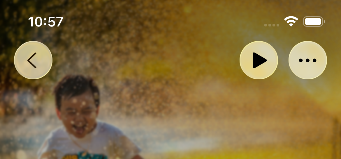
One of the first things any trained eye will notice about the new UI design in iOS 26 is how different app toolbars look. They look very different.
To me that's one of the most exciting changes and adopting this on day one is a way to set your app apart in a noisy world.
My first attempt at adopting it looked like this:
import SwiftUI

struct SettingsView: View {

    var body: some View {
        if #available(iOS 26.0, *) {
            form
                .toolbar {
                    ToolbarItem(placement: .topBarTrailing) {
                        NavigationLink(
                            destination: DiagnosticsView(
                                database: LocalDatabase.shared,
                                analyticsService: AnalyticsService()
                            )
                        ) {
                            Image(systemName: "stethoscope")
                        }
                    }

                    ToolbarSpacer(.fixed, placement: .topBarTrailing)

                    ToolbarItem(placement: .topBarTrailing) {
                        NavigationLink(destination: HelpView()) {
                            Image(systemName: "questionmark")
                        }
                    }
                }
        } else {
            form
                .toolbar {
                    ToolbarItem(placement: .topBarTrailing) {
                        NavigationLink(destination: HelpView()) {
                            Image(systemName: "questionmark.circle")
                        }
                    }
                }
        }
    }
}
As you can see, I'm using ToolbarSpacer, which is the new tool we get to achieve spacings we see fit. But you'll also notice I broke the view's Form into a subview so I could apply different .toolbar modifiers depending on OS version. This makes it very cumbersome to adopt the new toolbar everywhere in an app. I thought we just had to live with this.
In other views I got subviews to handle the entire toolbar for the sake of breaking up views and making them easier to read. Here's an example:
extension ReactionDetailView {

    struct ToolbarControls: View {

        @Binding var contentSortOption: Int
        let playStopAction: () -> Void
        let startSelectingAction: () -> Void
        let isPlayingPlaylist: Bool
        let soundArrayIsEmpty: Bool
        let isSelecting: Bool

        private var playStopIsDisabled: Bool {
            soundArrayIsEmpty || isSelecting
        }

        var body: some View {
            HStack(spacing: 15) {
                Button {
                    playStopAction()
                } label: {
                    Image(systemName: isPlayingPlaylist ? "stop.fill" : "play.fill")
                        .opacity(playStopIsDisabled ? 0.5 : 1.0)
                }
                .disabled(playStopIsDisabled)

                Menu {
                    // Omitted for readability
                } label: {
                    Image(systemName: "ellipsis")
                }
            }
        }
    }
}
But simply adding an if #available statement here did not satisfy the compiler.
    struct ToolbarControls: View {

        // Vars omitted

        var body: some View {
            if #available(iOS 26.0, *) {
                ToolbarItem {
                    Button {
                        playStopAction()
                    } label: {
                        Image(systemName: isPlayingPlaylist ? "stop.fill" : "play.fill")
                    }
                    .disabled(playStopIsDisabled)
                }

                ToolbarSpacer(.fixed)

                ToolbarItem {
                    Menu {
                        // Omitted for readability
                    } label: {
                        Image(systemName: "ellipsis")
                    }
                }
            } else {
                HStack(spacing: 15) {
                    // Older code
                }
            }
        }
    }
It would throw the following error on the first ToolbarItem declaration: Static method 'buildExpression' requires that 'ToolbarItem<(), some View>' conform to 'View'.
You could say the issue is right here in my face but I could not see it yet. I went asking on the iOS Folks Slack and a noble soul pointed out that .toolbar expects ToolbarContent and not a View. So here's the fix:
extension ReactionDetailView {

    struct ToolbarControls: ToolbarContent {

        // Vars omitted for readability

        var body: some ToolbarContent {
            if #available(iOS 26.0, *) {
                ToolbarItem {
                    Button {
                        playStopAction()
                    } label: {
                        Image(systemName: isPlayingPlaylist ? "stop.fill" : "play.fill")
                    }
                    .disabled(playStopIsDisabled)
                }

                ToolbarSpacer(.fixed)

                ToolbarItem {
                    Menu {
                        // Omitted for readability
                    } label: {
                        Image(systemName: "ellipsis")
                    }
                }
            } else {
                ToolbarItem {
                    Button {
                        playStopAction()
                    } label: {
                        Image(systemName: isPlayingPlaylist ? "stop.fill" : "play.fill")
                            .opacity(playStopIsDisabled ? 0.5 : 1.0)
                    }
                    .disabled(playStopIsDisabled)
                }

                ToolbarItem {
                    Menu {
                        // Omitted for readability
                    } label: {
                        Image(systemName: "ellipsis")
                    }
                }
            }
        }
    }
}
Keep in mind that while ToolbarSpacer is a new component (and therefore will not compile in previous Xcode versions) ToolbarItem is not so it's completely fine to use it for iOS versions all the way back to 14.0.
Now our views can be as simple as:
struct SomeView: View {

    var body: some View {
        VStack {
            // Your stuff
        }
        .toolbar {
            YourCustomToolbarThatAdaptsToOSVersion()
        }
    }
}
Thank you for reading. Be sure to subscribe and leave a comment. SwiftUI is neat, it just takes some digging to fully love it. :)